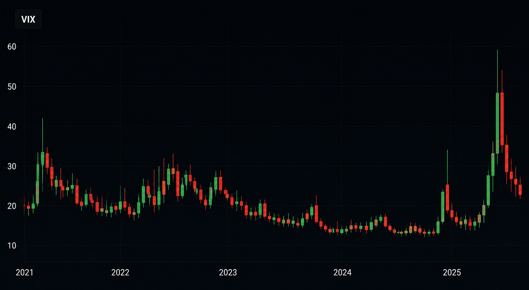
The VIX Term Structure Explained Through Today's Market
The VIX is quoted constantly and understood rarely. It is not a fear gauge in any literal sense, and the headline number is arguably the least informative part of the data set. What carries real information is the shape of the curve behind it, because that shape describes what the market is willing to pay for protection at different horizons. Learning to read it turns volatility from a mood indicator into a set of observable conditions.
What the VIX term structure is
The index itself estimates expected thirty-day volatility implied by options on a broad equity benchmark. Futures on that index trade across a series of monthly expiries, and plotting those futures produces the curve. Because the underlying is an estimate of future variance rather than a tradeable asset, the curve behaves differently from a commodity or rate curve. Each point represents what the market expects volatility to be over a specific window, adjusted by whatever premium participants demand for carrying that risk.
Contango, the normal state
Most of the time the curve slopes upward, with distant contracts priced above near ones. This reflects two things: uncertainty grows with horizon, and there is persistent demand for longer-dated protection from portfolios that must hedge. The practical consequence is a roll cost. Anyone holding long volatility exposure through a futures product pays that slope over time, which is why long volatility positions tend to bleed value in calm markets even when the spot index is unchanged. Understanding that mechanic explains most of the confusion around volatility products.
Inversion and what it signals
When near-term contracts price above longer-dated ones, the curve is inverted. This happens when immediate hedging demand overwhelms the structural premium in later months, typically during a sharp selloff or ahead of a binary event. Inversion tells you that participants are paying a premium for protection right now rather than for the coming year, which is a statement about urgency rather than about direction. Historically, deep inversions have coincided with periods of stress and have tended not to persist, since the conditions producing them either resolve or become the new baseline.
Reading the curve alongside other data
The curve is more informative when paired with related measures. The spread between implied and realised volatility shows whether protection is expensive relative to what the market has actually delivered. Skew shows whether the demand is for downside protection specifically or for movement generally. Volume in the front two contracts shows whether the shape is being set by real hedging or by thin trading. Index breadth adds context about whether volatility is broad-based or concentrated in a few large names, and the Market Forecast Hub is a practical place to compare these series together.
What the curve does not tell you
The shape is not a timing tool. A flat curve can persist for months, and an inverted curve can invert further. Volatility indices measure the price of expected movement, not the direction of the underlying, so a rising curve is not automatically bearish for equities. And because the index is calculated from a specific option universe, unusual activity in a small number of strikes can distort it briefly without describing broad conditions.
What would break the standard interpretation
The framework depends on the structural hedging demand that produces contango. If that demand were to change permanently, through regulation, a shift in how institutions hedge, or the growth of products that systematically sell rather than buy protection, the normal shape could change and the historical interpretation would need revisiting. Sustained inversion across a full year, or contango disappearing during calm markets, would both be evidence that something structural had shifted.
Becoin.net Tariff Plans ---> Here
Why this belongs in analysis
The curve is a description of conditions: how urgent hedging demand is, how expensive protection has become, and how much the passage of time costs anyone holding volatility exposure. That is context for interpreting equity moves, not an instruction to take a position, and nothing here constitutes a recommendation.
Deriv Volatility 75 Strategy Backtest: What Actually Works After 1,000 Trades?
The first time I tried trading Volatility 75, I thought I had found the perfect market. No news shocks. No central banks. Just clean, continuous price movement. Within two weeks, I blew my first account. That experience forced me to stop guessing and start testing. Instead of chasing indicators or copying strategies from forums, I […]
How Understanding Market Structure Saved My Day Trading
I remember the exact moment my trading account hit zero for the third time in a single month. It was a rainy Tuesday evening, and I was staring at a 1-minute chart on my laptop screen. The price had been moving up aggressively. It looked like a flawless rocket ship to the moon. I clicked […]
How I Learned to Sit on My Hands During Choppy Markets
I remember the morning vividly. It was a Tuesday. The coffee on my desk was still piping hot, the charts on my screen were blinking, and I was feeling incredibly confident. I had just finished reading about how market open hours create the best trading opportunities, and I was ready to hunt for a clean […]

How Many People Own Bitcoin? (2026 Data, Charts & Country Breakdown)
About 365 million people owned Bitcoin in 2025 - roughly 4-4.5% of the world and nearly half of all crypto owners. See the year-by-year growth curve, country data, whole-coin rarity, and why estimates disagree.
Finding My Perfect Workspace: The Search for the Best Broker for My Daily Trading Routine
The alarm goes off at 6:00 AM. By 6:30 AM, I am sitting in front of my monitors with a steaming mug of black coffee. The house is completely quiet, the market is preparing its next major move, and my charts are completely bare. This is my daily sanctuary. For a long time, this morning […]

The Best Broker Without Complicated Features (And Why Simplicity Wins)
Most traders don’t fail because they lack knowledge. They fail because their platform buries them in noise before they even place their first trade. Here’s what actually works. It Started With a Confession From a $10 Trader A reader messaged us a few months back. He had been trying to trade for three weeks, had […]