How to Spot Exhaustion Before a Reversal
It was 2:15 AM on a rainy Tuesday. The charts on my screen looked textbook perfect. A massive green candle was bursting through a week-long resistance level on EUR/USD. The momentum felt unstoppable.
Everything in my gut shouted buy. I doubled my standard position size, entered the trade, and leaned back in my chair with a confident grin. I thought I was riding a powerful new trend.
Three minutes later, that giant green candle froze. The volume was astronomical, yet the price stopped dead in its tracks. Then, without warning, the candle melted downward, leaving a long, hideous tail at the top. Within twenty minutes, the entire breakout collapsed into a sharp sell-off. My account took a $4,200 hit before I could even process what happened.
That night forced me to confront a hard reality: I had jumped headfirst into a classic market trap. What I thought was institutional buying power was actually the final, desperate breath of an exhausted trend.
Since that painful lesson, my entire trading approach has shifted. I stopped chasing aggressive momentum and began learning how to read the subtle warning signs of trend fatigue. In this guide, I will walk you through the exact framework I use today to spot market exhaustion before a reversal takes place, saving you from liquidating your hard-earned capital on false breakouts.
Decoding Trend Fatigue: Why Velocity Lies
Early in my trading journey, I assumed that big, aggressive candles signaled underlying strength. I believed that the faster price moved toward a level, the more likely it was to break through.
That belief is one of the most expensive misconceptions in retail trading.
When a trend approaches a major support or resistance level with extreme speed and unusually large candles, it often represents a buying or selling climax rather than sustainable momentum. This happens because retail traders suffer from FOMO (Fear Of Missing Out) and rush into the market at the absolute worst moment. Meanwhile, institutional liquidity providers use that sudden surge in retail enthusiasm to exit their positions and fill large counter-trend orders.
To identify whether a move represents genuine strength or terminal fatigue, you must analyze the relationship between price action and volume.
Understanding Volume-Price Divergence
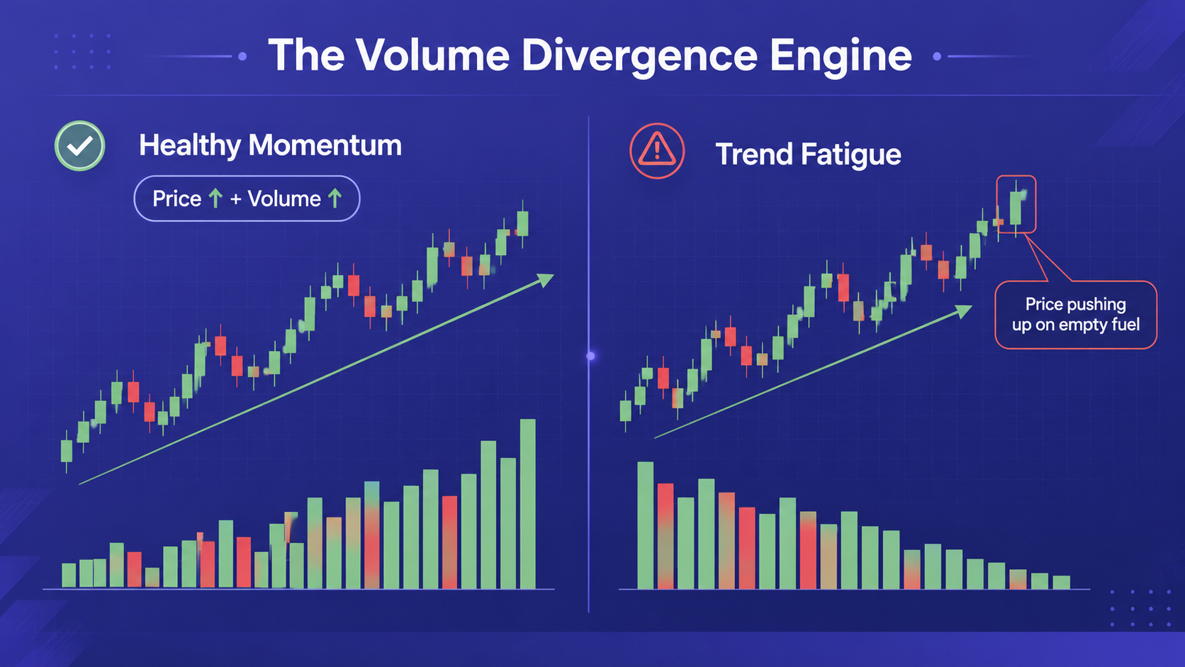
Genuine momentum requires steady participation from big institutional players. When a market makes a new high, volume should naturally expand to confirm that buyers are actively bidding up the price.
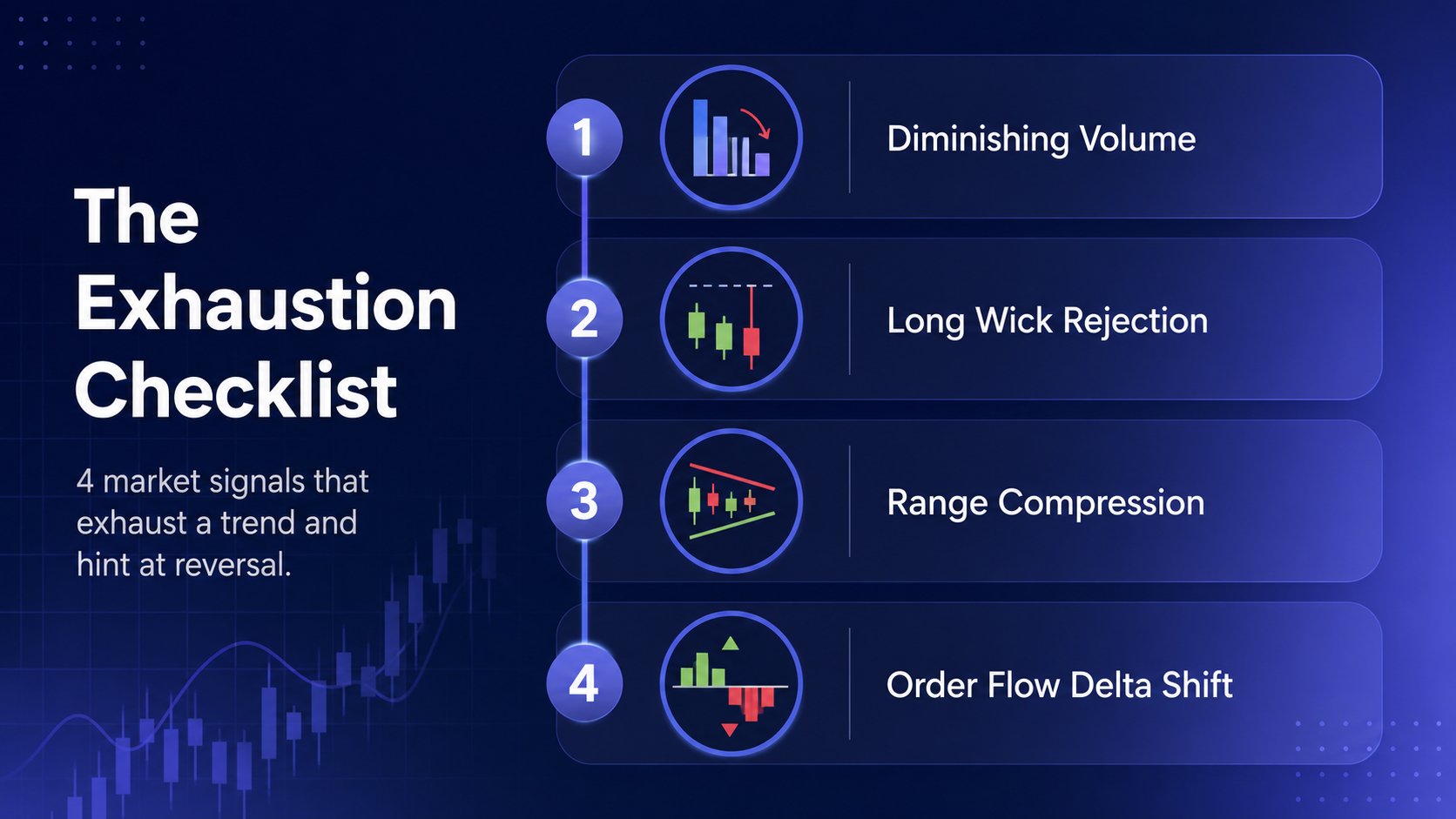
When you see price pushing to a fresh high while volume steadily declines, you are observing volume divergence.
Think of it like a vehicle driving up a steep hill. If the driver presses the gas pedal but the speedometer starts dropping, the engine is struggling. In trading, declining volume during a price surge tells you that large players are no longer participating. The movement is carried purely by late retail buyers. Once those retail orders dry up, the price collapses under its own weight.
If you are currently refining your technical analysis skills and want to stay updated on key market concepts, checking out the latest educational breakdowns on the BeCoin Blog will give you a solid foundation in market mechanics.
The Anvil Pattern: Spotting High-Probability Reversals
After years of staring at live charts across multiple asset classes, I began noticing a repeatable price pattern that consistently signals exhaustion near key levels. I call it the Anvil Pattern.
The Anvil Pattern forms when price aggressively tries to push beyond an established support or resistance zone, fails instantly, and leaves behind a specific footprint on the chart.
Step 1: The Blow-Off Extension
The pattern begins with a noticeable extension candle. This candle is usually 1.5 to 2 times larger than the average candle in the preceding move. It creates the illusion that a massive breakout is underway, pulling in breakout traders who place market orders right at the high of the range.
Step 2: The Overhead Wall
As price pushes into liquidity, it encounters a wall of institutional limit orders waiting on the opposite side. If buyers are trying to push price higher, heavy institutional sell orders absorb every single purchase order without letting price advance further.
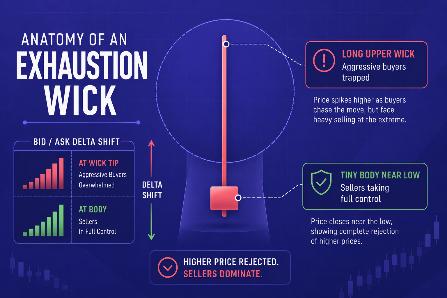
Step 3: The Rejection Wick and Delta Shift
The candle closes near its low, leaving behind a long upper wick that is at least twice the size of the candle body. When you look at the underlying order flow delta, you will see a massive positive delta spike during the wick formation that rapidly turns negative before the candle closes.
When I spot this pattern forming on high-level charts, I instantly cancel any breakout plans. It signals that buyers pushed with everything they had, ran completely out of gas, and were immediately overpowered by institutional sellers.
Reading the Micro-Structure: The Three Signs of Climax
Beyond candle shapes and volume metrics, the micro-structure of price action provides incredible context. Before a market turns around, it almost always leaves behind three distinct clues on shorter timeframes.
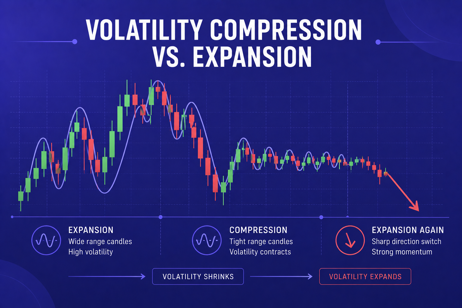
1. Volatility Compression
Before a major reversal, price action frequently transitions from clean, trending moves into tight, overlapping candle ranges near major levels. This compression indicates that buyers and sellers are engaged in a fierce battle, but neither side is gaining ground. When compression occurs after a long upward run, it usually means the buyers have lost their directional drive.
2. The Absorption Candle
An absorption candle occurs when a huge volume spike takes place within a very small candle body. When you see massive volume accompanied by little to no price progress, it means heavy institutional absorption is occurring. Someone is filling large limit orders right into the incoming momentum.
3. Failure to Retest
In a healthy trend, when price pulls back slightly, buyers jump in at higher lows to maintain control. During trend exhaustion, pullbacks start becoming deeper, and subsequent rallies fail to reach previous peak highs. This sequence of lower highs on lower timeframes is often the final confirmation that a trend is dead before the macro chart catches up.
To test these price action concepts across various markets without risking real capital right away, practicing on flexible execution platforms like IQ Option or exploring the intuitive trading interfaces at ExpertOption and Olymp Trade can provide valuable real-time chart experience.
Applying the Blueprint Across Trading Platforms
Whether you trade forex, crypto, indices, or short-term day trading, spotting exhaustion relies on executing your analysis with precision and discipline.
When I prepare my daily watchlists, I keep my execution workflow clean and systematic across my preferred brokers:
- Identify Key Daily Levels: I mark major multi-touch support and resistance zones on higher timeframes first.
- Monitor Price Approach Velocity: I watch how price approaches those zones. Rapid, overextended moves raise immediate red flags.
- Verify Volume & Delta: I check if volume is contracting as price nears the level.
- Wait for Rejection Confirmation: I never guess a top or bottom. I wait for an Anvil pattern or absorption candle to confirm that institutional counter-orders are active.
Different platforms offer distinct chart tools and layout options that suit various trading styles. For fast execution and seamless chart visualization, many traders utilize platforms like Quotex,Pocket Option, or CapitalCore. If you trade synthetic indices or custom financial assets, testing setups on Deriv can also help you hone your structural analysis skills.
The Edge You Need: Beyond Basic Price Action
Learning to spot exhaustion transformed my personal trading results, turning painful false breakout losses into consistent, high-probability reversal entries. But mastering chart reading is only half the battle. To consistently stay ahead of shifting market regimes, you need institutional-grade insights, clear forecasting data, and actionable daily analysis.
Instead of navigating the charts alone and guessing where institutional liquidity lies, you can upgrade your complete trading framework.
By accessing the real-time projections inside the BeCoin Forecast Hub, you gain clear line-of-sight on major market levels, liquidity clusters, and structural turning points before they develop on retail charts.
And if you are ready to take your trading to an elite level, it is time to secure your ultimate market edge. Join the BeCoin Premium Plan today to get in-depth daily analysis, premium trade setups, institutional order flow breakdowns, and actionable market strategies designed to keep you on the right side of every major move. Stop getting trapped by fake breakouts and start trading with confidence.

Trading Currency Strength Instead of Single Pairs
It was a Tuesday afternoon when I realized I was fighting a losing battle against a ghost. My screen was a chaotic web of indicators. I had the EUR/USD chart open, a moving average crossing over here, a relative strength index flashing oversold there, and a price action setup that looked textbook perfect. I clicked […]

How Understanding Market Structure Saved My Day Trading
I remember the exact moment my trading account hit zero for the third time in a single month. It was a rainy Tuesday evening, and I was staring at a 1-minute chart on my laptop screen. The price had been moving up aggressively. It looked like a flawless rocket ship to the moon. I clicked […]

Best Broker for Learning Price Action in 2026 (Tested by Real Traders)
Most traders think they need a better strategy. What they actually need is a better understanding of price. A few years ago, one of our community members had over ten indicators on his chart. RSI. MACD. Moving averages. Bollinger Bands. Stochastic. Every new YouTube video added another indicator. The result? More confusion. Not more profits. […]

Deriv vs IQ Option for Synthetic Indices: Which Platform Is Better in 2026?
Synthetic indices have become one of the most talked about trading categories among beginners and experienced traders alike. Unlike forex or crypto markets that depend on real world events, synthetic indices operate 24/7 using algorithm driven price movements. That means traders can access opportunities at any time without waiting for market openings or major news […]

Deriv Volatility 75 Strategy Backtest: What Actually Works After 1,000 Trades?
The first time I tried trading Volatility 75, I thought I had found the perfect market. No news shocks. No central banks. Just clean, continuous price movement. Within two weeks, I blew my first account. That experience forced me to stop guessing and start testing. Instead of chasing indicators or copying strategies from forums, I […]
Why Most Deriv Traders Blow Accounts: A Data-Driven Post-Mortem Analysis
The first time I blew a trading account on Deriv, it didn’t happen dramatically. There was no single catastrophic trade. It happened quietly. One loss turned into another. Then I increased the stake to recover the loss. Then the market moved again. Before I realized what had happened, an account balance that took weeks to […]