
How to Read Candle Wicks Correctly
Early in my trading journey, I thought I had everything figured out. I knew all about support and resistance, moving averages, and MACD crossovers. Yet, my account kept bleeding. I vividly remember sitting in front of my desk at 2 AM, watching a strong bullish green candle form on the chart. Everything in my setup said "buy." I entered a long position, confident that the momentum would push prices higher.
Within minutes, the green body shrank. A massive upper wick shot up like a lightning rod, leaving a tiny body near the bottom of the bar. Before I could react, the price plummeted, hitting my stop-loss.
I sat there staring at the screen, frustrated and confused. The chart hadn't lied to me; I just didn't know how to read what it was trying to say. That long upper wick was a loud signal of seller rejection, but I was too focused on the green body to notice it.
That night was a turning point. I stopped looking at candlestick charts as simple colorful boxes and started viewing each candle as a live tug-of-war between buyers and sellers. The wicks (or shadows) are the footprints of that battle. Once you learn to interpret what those footprints mean, your entire perspective on market dynamics changes.
Anatomy of a Wick: What Price Shadow Actually Means
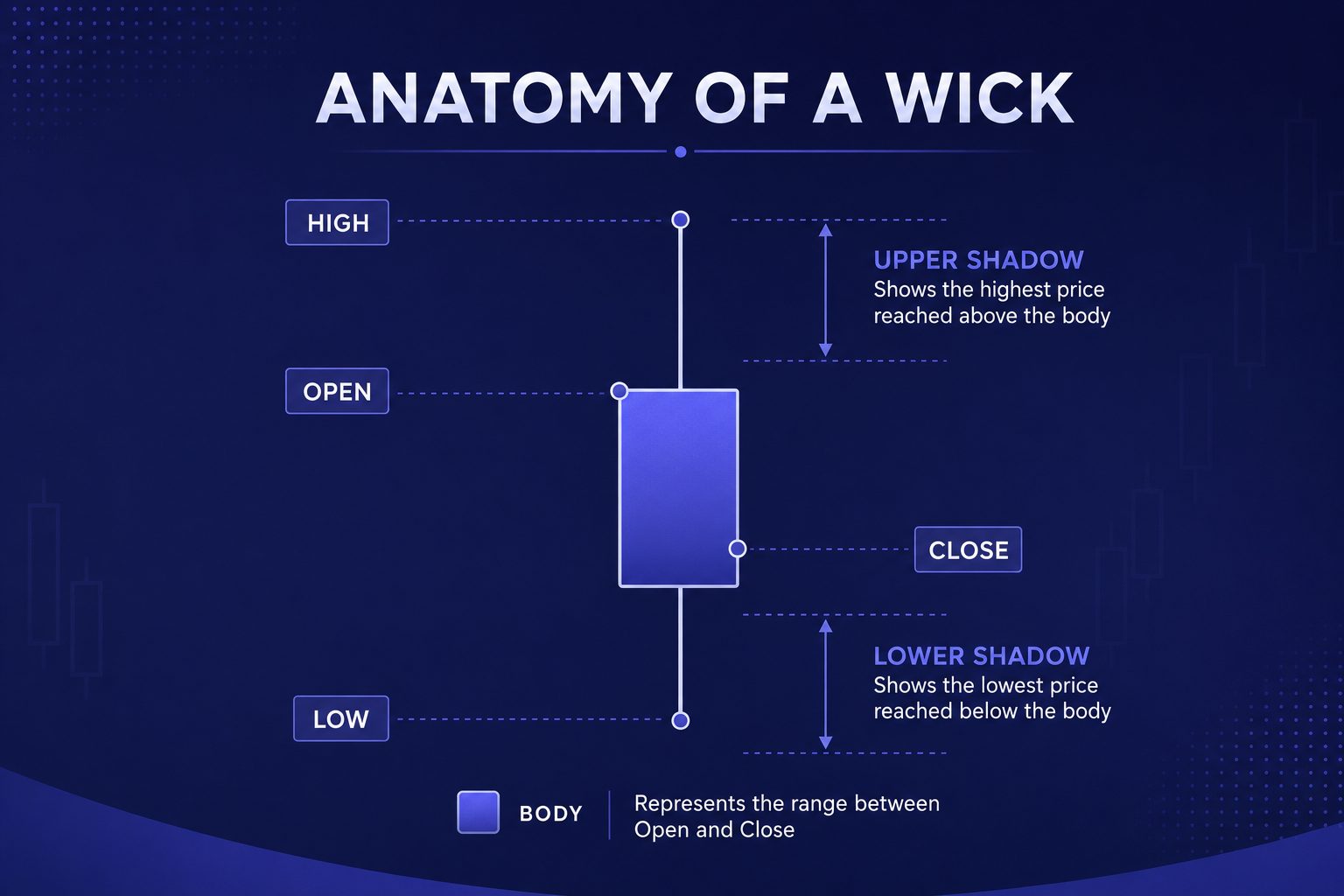
To master wick analysis, you first need to break down the mechanics of a candlestick. Every candlestick tells a story over a specific timeframe, whether it's one minute, one hour, or one day.
The rectangular center is the body, representing the distance between the open price and the close price. The thin lines protruding from the top and bottom are the wicks, also known as shadows or tails. The tip of the upper wick represents the absolute highest price reached during that time period, while the tip of the lower wick represents the absolute lowest price.
When you see a long wick, it means price moved aggressively in that direction during the session, but was pushed back before the session closed.
Think of a wick as an elastic band. The longer the wick stretches in one direction, the stronger the counter-force that snapped it back. When a candle closes with a long upper shadow, it means buyers tried to push the price higher, but sellers stepped in with overwhelming volume and pushed it back down. Conversely, a long lower shadow means sellers pushed price down, but buyers stepped in to absorb the selling pressure and drive price back up.
If you want to practice identifying these shadow dynamics on real-time charts without risking real capital, setting up a demo environment on flexible trading platforms can give you practical experience. You can test your shadow reading skills on platforms likeIQ Option or explore multi-asset setups onBinomo to see how wicks form across different market conditions.
Decoding the Three Core Wick Patterns
Over years of analyzing charts, I have found that almost every high-probability wick setup falls into one of three distinct categories:
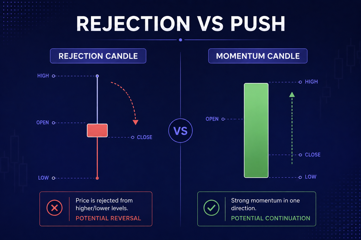
1. The Rejection Wick (Pin Bar Mechanism)
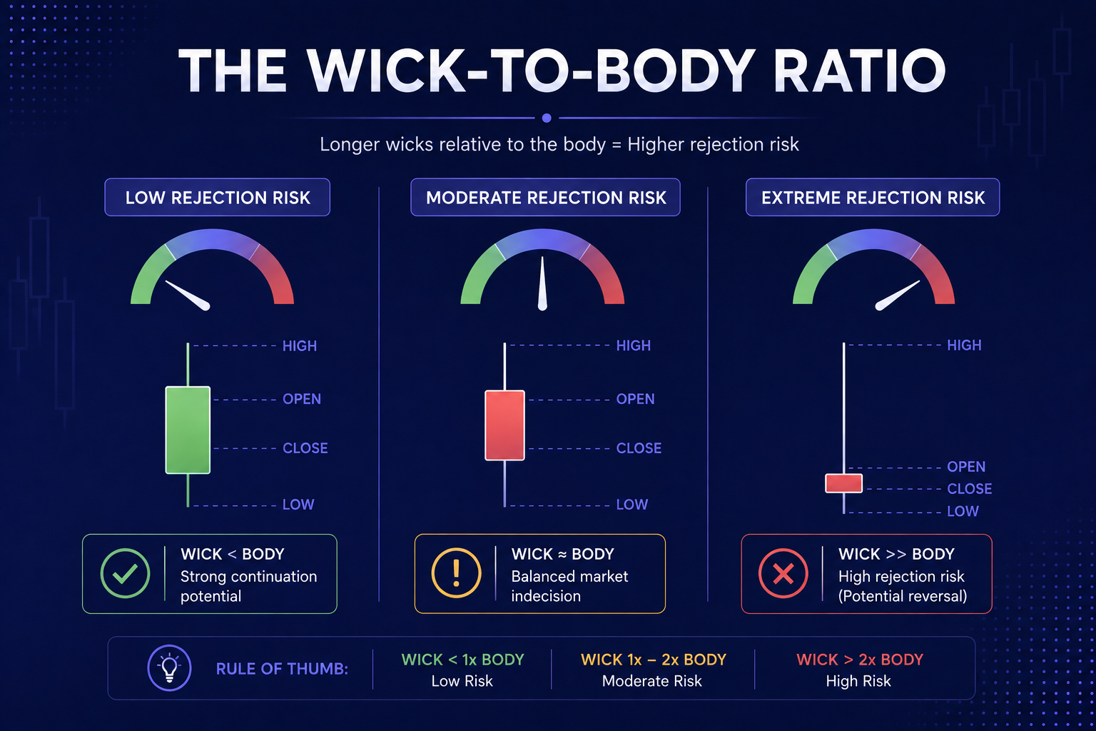
A rejection wick features a shadow that is significantly longer than the candle body—usually at least two to three times the length. When this appears at a key support or resistance level, it signals a sharp turn in sentiment.
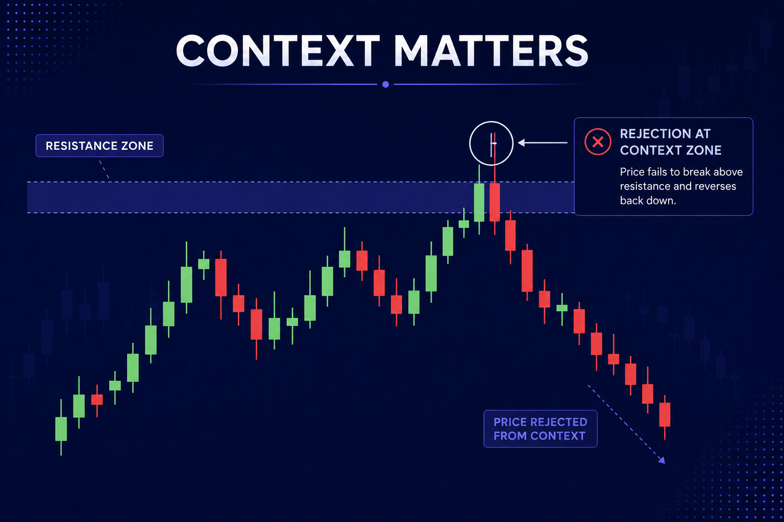
For instance, if price approaches a major resistance zone and forms a long upper wick with a tiny body at the bottom, it shows that buyers ran out of steam and sellers completely took control. This pattern forms the core of classical reversal trading.
2. The Exhaustion Spike
Exhaustion spikes usually appear at the end of extended market trends. After a prolonged move upward, you might notice an unusually long upper wick that dwarfed previous candles. This is often the result of retail traders chasing the trend while institutional market participants use the sudden surge in liquidity to exit their positions or build short positions. Recognizing this allows you to exit trades before a sudden turn or position yourself for a counter-trend move.
3. The Liquidity Grab or Fakeout
One of the most frustrating experiences for traders is having their stop-loss hit right before price reverses in their favored direction. This often happens because big market players need liquidity to fill large orders. They intentionally push price beyond obvious support or resistance levels to trigger stop-loss orders and breakout entries. Once that liquidity is swept, price immediately snaps back, leaving a long wick behind.
Context Is Everything: Why Location Matters
Early on, I made the mistake of trading every long wick I saw. I quickly learned that a long wick in the middle of a consolidation zone means something completely different than a long wick at a key historical support level.
A wick in a tight consolidation range usually represents market noise and low liquidity. However, when a long lower wick forms right at a major historical support level during high trading volume, it carries significant weight.
To evaluate the strength of a wick signal, always ask yourself three questions:
- Where is this wick forming relative to key market levels?
- Does the wick size stand out compared to the surrounding candles?
- What is the broader trend context on higher timeframes?
A long wick that aligns with the higher timeframe trend is far more reliable than one fighting against a strong market movement. For example, if the daily chart is strongly bullish, a long lower wick on a 15-minute chart offers a high-probability entry point in the direction of the main trend.
Combining Wick Analysis with Price Action Strategies
Wick analysis is most powerful when combined with other price action tools. Here is how I integrate wick reading into a coherent strategy:
First, mark key supply and demand zones on your chart. When price approaches these zones, pay close attention to candle formation as it touches the boundary. Look for candles where wicks begin to stretch while the real bodies shrink. This transition signals that price momentum is decelerating and a potential turn is forming.
Second, observe how wicks interact with moving averages or trendlines. A classic continuation setup occurs when price pullbacks to a 20-period exponential moving average (EMA) in an uptrend, leaves a long lower wick touching the average, and closes back above it. This shows that buyers actively defended the moving average, confirming the trend's health
If you are expanding your trading toolkit, studying structural setups across different platforms can sharpen your analytical edge. You can monitor how wicks behave during volatile news events on platforms such asPocket Option or explore fast execution setups onQuotex. For alternative platform environments, traders often evaluate market conditions usingExpertOption, analyze standard technical indicators onOlymp Trade, or monitor multi-asset charts onCapital Core.
Understanding the subtle details of price movement requires practice, but integrating these visual cues into your daily routine helps you stay ahead of market shifts. To deepen your understanding of foundational market concepts, explore the detailed guides available on theBecoin Blog, where we cover a wide range of trading topics designed to help you build a well-rounded strategy.
Transforming Chart Analysis into a Trading Advantage
Reading candle wicks correctly removes much of the guesswork from your trading. Instead of guessing where the market might head next, you learn to read the real-time balance of supply and demand directly off the chart.
Remember that wicks represent price action that was tested and rejected. They show you where big market participants entered, where liquidity sits, and where momentum is starting to fade. By looking beyond the colored bodies of candlesticks and studying the stories their shadows tell, you transform your technical analysis from reactive guessing into a structured approach.
If you are ready to stop second-guessing your entries and want professional-grade trade ideas, real-time market updates, and structured analysis, explore our detailed forecasts at theBecoin Forecast Hub.
To get complete access to deep market insights, institutional-grade trade setups, and a community of dedicated traders, upgrade your strategy today by joiningBecoin Premium Tariff Plans and take your trading performance to the next level.

Can You Start Trading with $10 on Deriv?
A lot of beginners enter trading with the same question: “Is $10 actually enough to start trading on Deriv?” The short answer is yes. But the real answer is more complicated. You can start with $10 on Deriv, but whether you can survive, learn, and grow that account depends entirely on your expectations, discipline, and […]

Binomo First $10–$50 Test Deposit Plan: The Safest Way to Validate the Platform Before Scaling
I didn’t start with confidence. I started with doubt. Every time I searched for answers about Binomo, I found opinions, not proof. Some people claimed fast withdrawals. Others complained about delays. But almost nobody showed a complete journey from deposit to withdrawal using real money. So I stopped reading and started testing. Instead of risking […]

Is Binomo Safe or Risky in 2026? A Practical User Checklist (Not a Generic Review)
I still remember the first time I opened Binomo. It wasn’t excitement. It was hesitation. I had already read multiple reviews. Some said it was safe. Others called it risky. None of them felt like they came from someone who had actually traded, deposited, withdrawn, and dealt with real friction. So I decided to test […]

How I Learned to Sit on My Hands During Choppy Markets
I remember the morning vividly. It was a Tuesday. The coffee on my desk was still piping hot, the charts on my screen were blinking, and I was feeling incredibly confident. I had just finished reading about how market open hours create the best trading opportunities, and I was ready to hunt for a clean […]

The Clock and the Candle: How I Stopped Guessing the Best Time to Trade Day Trading
I still remember the night I blew my third trading account. It was 11:30 PM. The house was completely quiet, the market charts on my screen were barely crawling, and I was forcing trades out of pure impatience. I kept staring at a flatline asset, placing one-minute positions, convinced that the market owed me a […]

Deriv vs Binomo Deposit Methods: My 2026 Real Money Comparison Guide
I sat in the corner of a crowded coffee shop, my eyes fixed on my phone screen. After months of testing strategies on a demo account, I had finally saved up a small pocket of risk capital. I felt ready to trade live. A high-probability setup was forming on my charts, and my heart rate […]